Enter password to view case study
Hirehoot
The hiring platform
for GTM Teams
[INDUSTRY]
Recruitment & HR Tech
[PLATFORM]
Web App
[ROLE]
Product Designer
[PROJECT TEAM]
Doğukan Demirel
[PROJECT OVERVIEW]
HireHoot is a privacy-first recruitment platform built for senior Growth, Sales, and Marketing hiring. Candidates stay completely anonymous until both parties sign a mutual NDA no name, no face, just signal.
As the sole product designer, I owned the full design process across both sides of the platform the candidate-facing product (B2C) and the company/recruiter-facing product (B2B): information architecture, design system, and high-fidelity prototypes across the candidate dashboard and messaging center.
Backed by Techstars '24, NatWest Accelerator, and Hive Founders.
[THE CHALLANGE]
[ROLE & RESPONSIBILITIES]
[RESEARCH ACTIVITIES & KEY INSIGHTS]
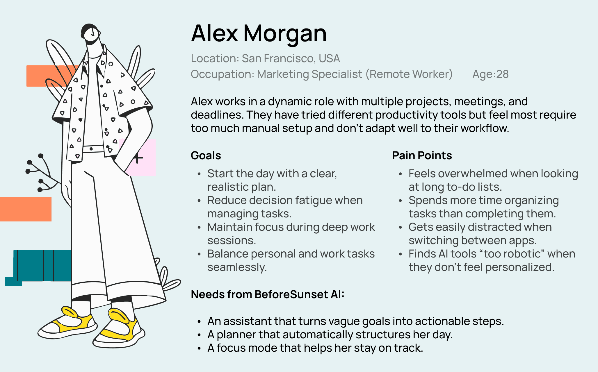
When we started shaping BeforeSunset AI, our main focus was to understand how professionals currently plan their days and where the biggest pain points existed.
Research Activities:
Competitive Analysis: Studied tools like Todoist, Akiflow, and Motion to identify gaps.
User Interviews: Talked with professionals and freelancers who struggled with daily planning.
Behavioral Insights: Observed that most users wrote tasks vaguely or scattered across different tools, and had difficulty sticking to one consistent system.
Key Insights:
Users often start their day without a clear plan, leading to stress and missed deadlines.
Productivity apps felt overwhelming with too many options and complex UIs.
Users wanted automation, but also control — AI should assist, not replace.
Maintaining focus was as important as task management (distractions were a big challenge).
[BRANDING DESIGN]
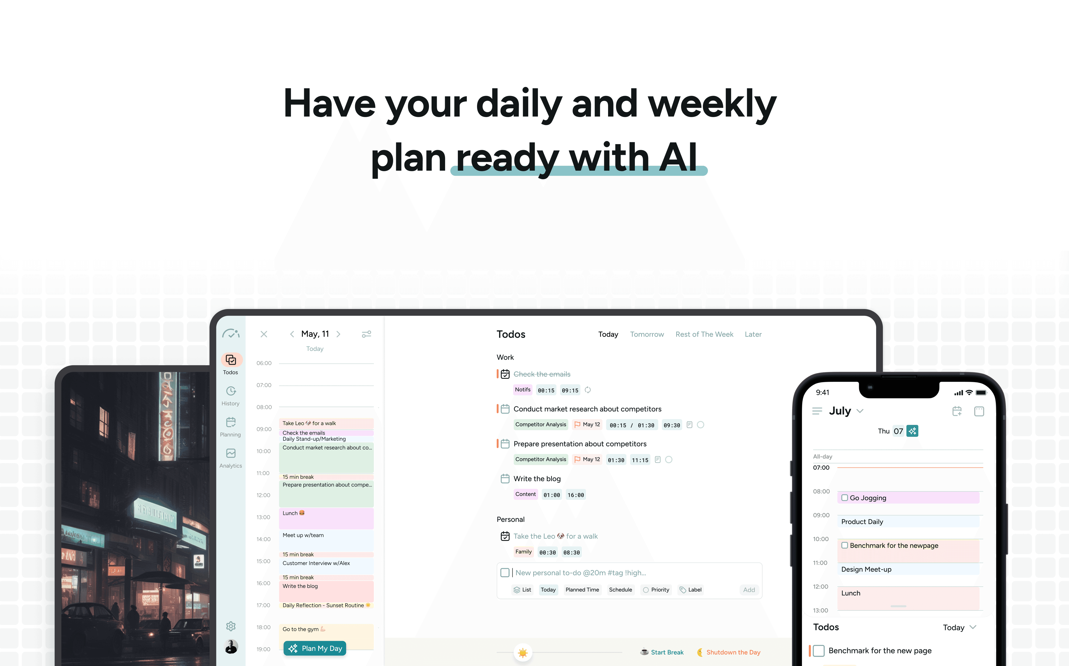
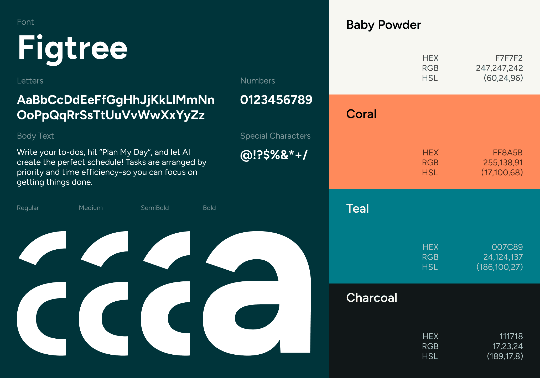
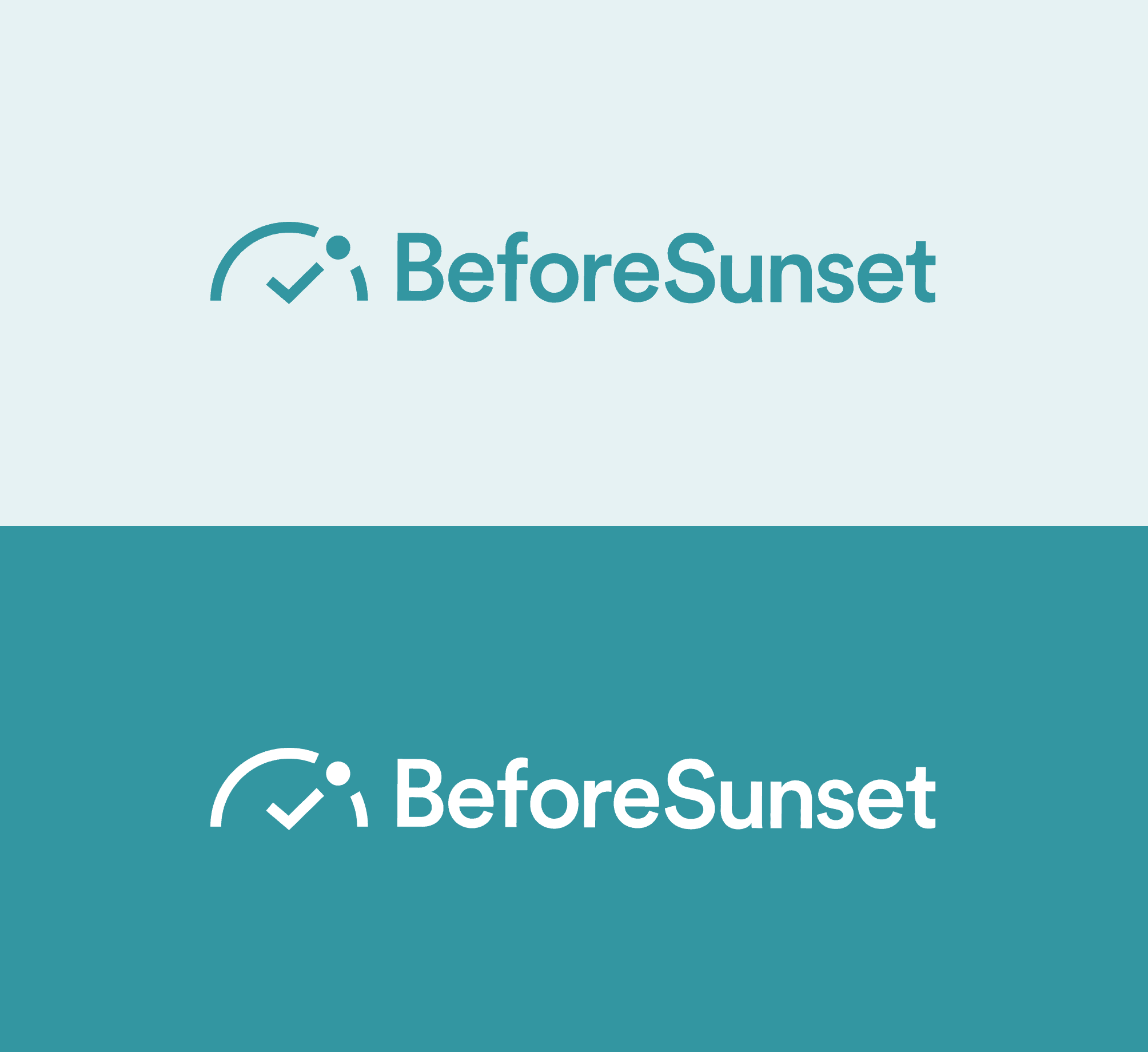
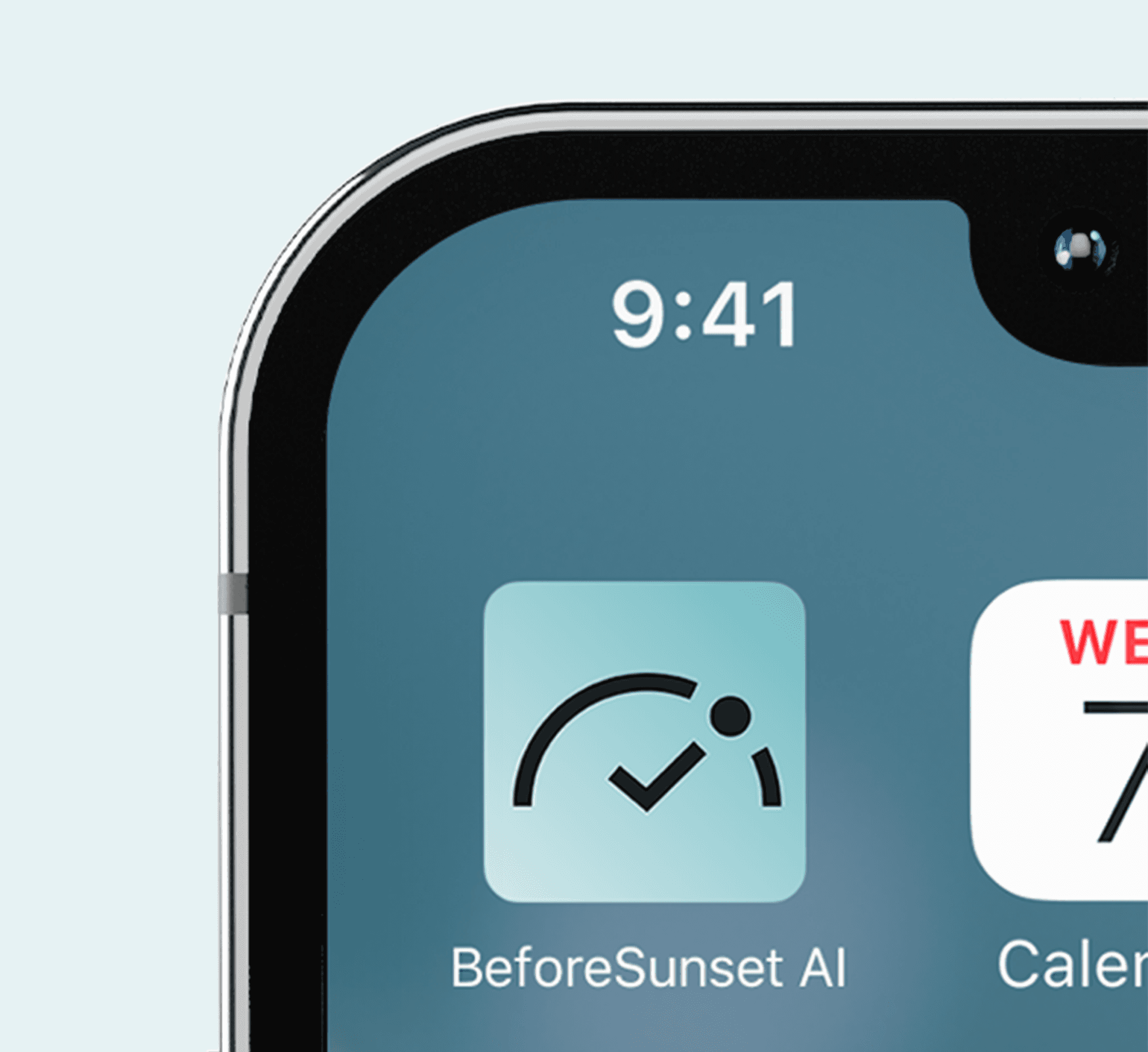
BeforeSunset AI’s visual identity is built around a clean and energetic style that balances clarity with motivation. The Figtree typeface ensures readability while keeping a modern and approachable tone. The color palette — Baby Powder, Coral, Teal, and Charcoal — reflects a mix of calm focus and vibrant energy, aligning with the product’s mission to make planning both efficient and enjoyable. The branding system extends across web, mobile, and marketing assets to create a consistent, recognizable experience.
[CROSS-PLATFORM EXPERIENCE]
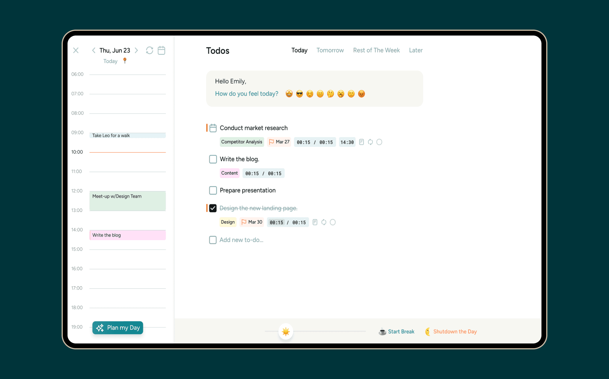
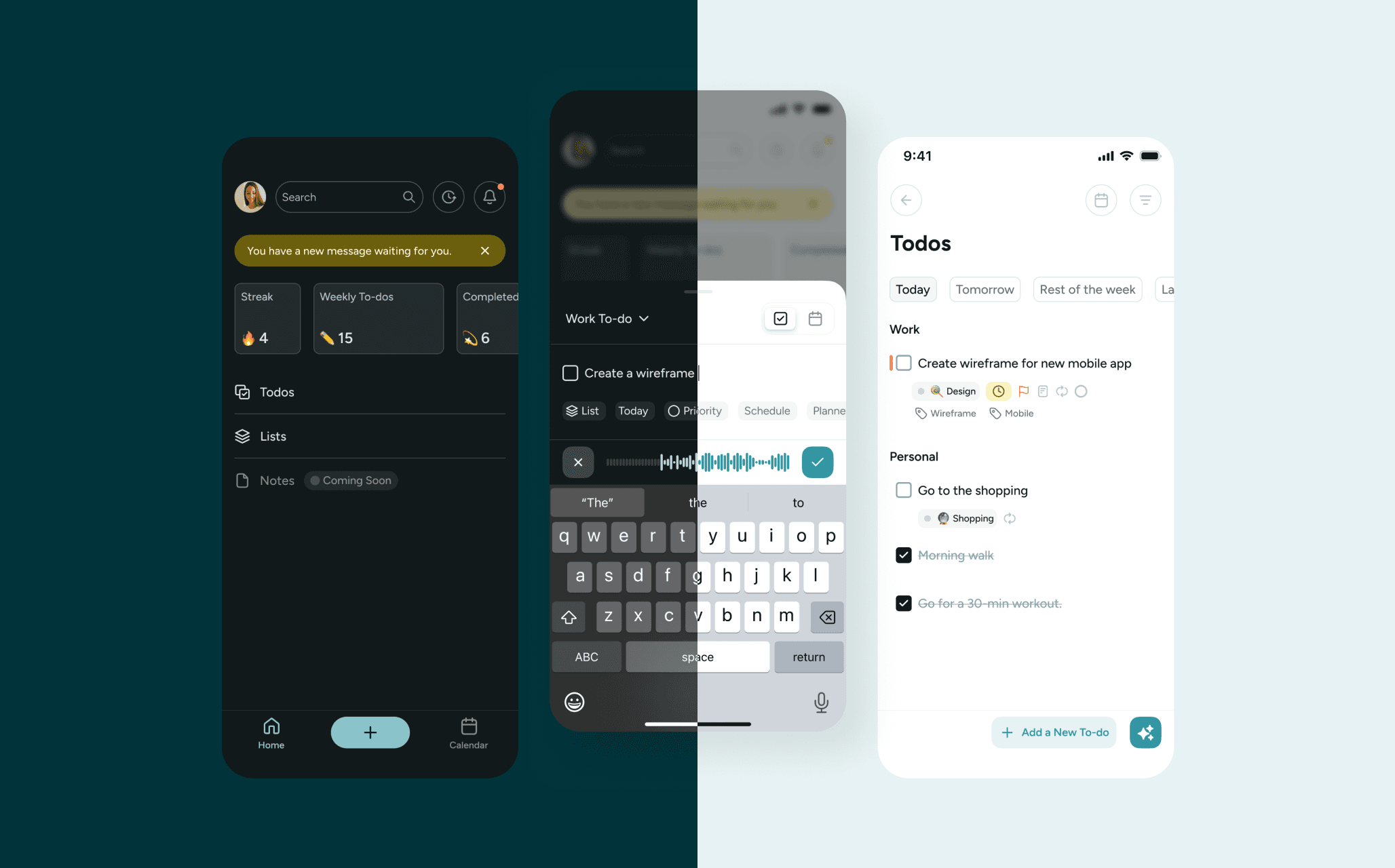
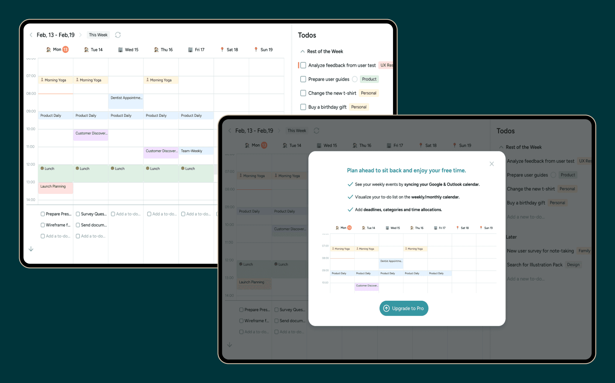
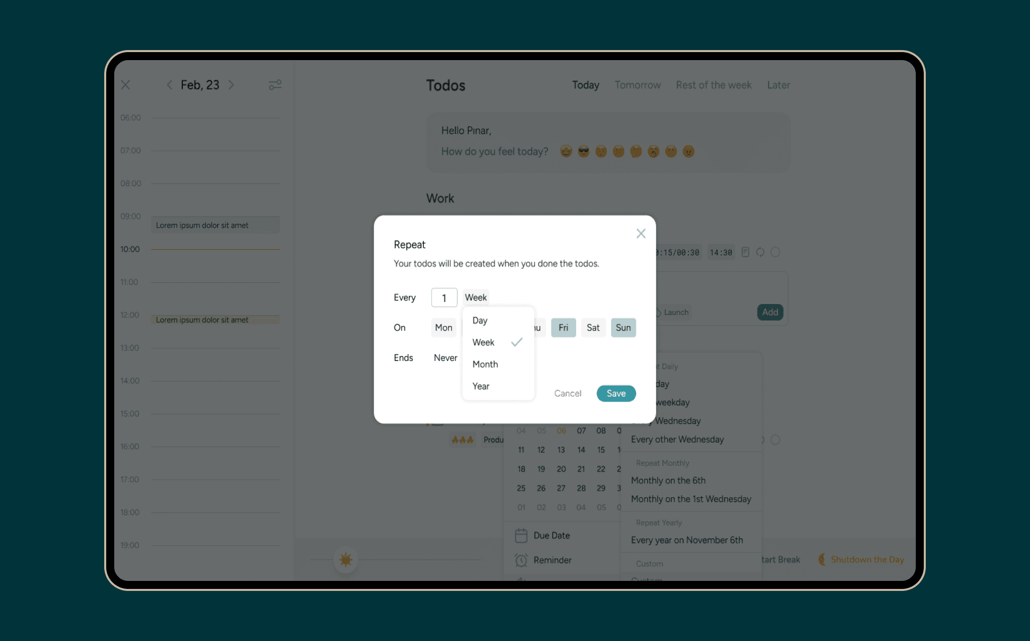
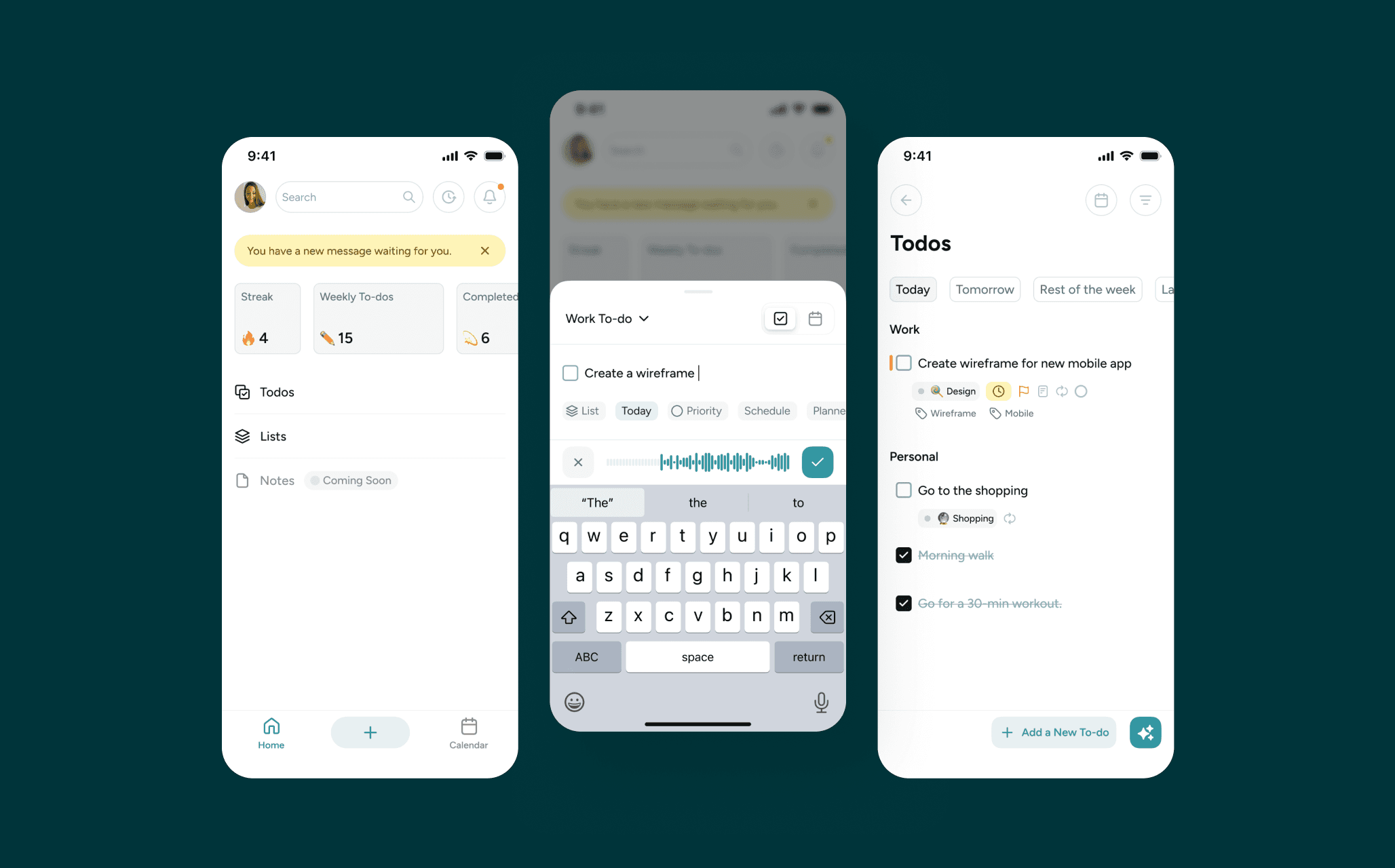
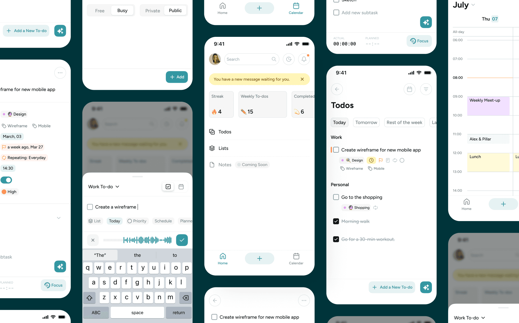
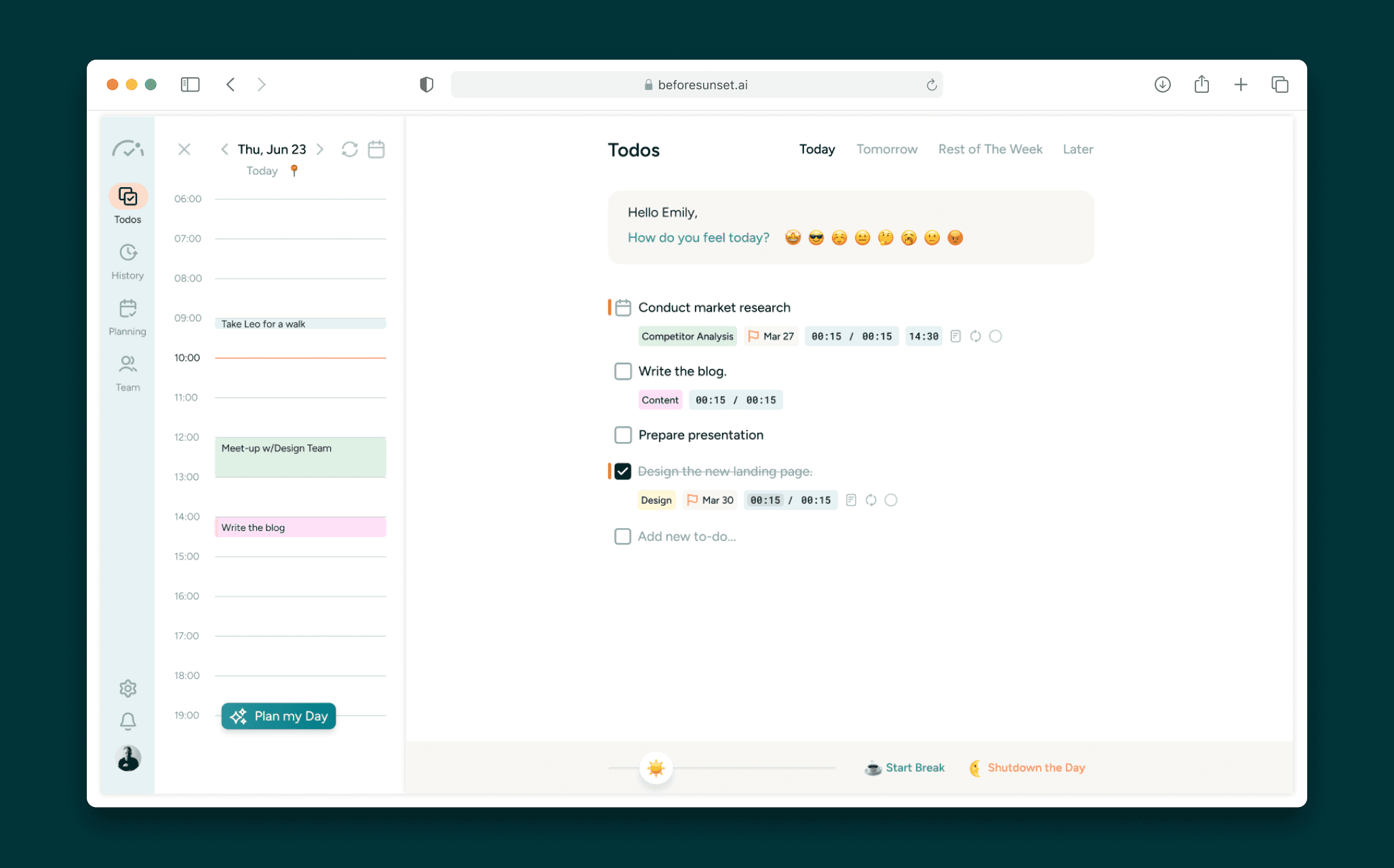
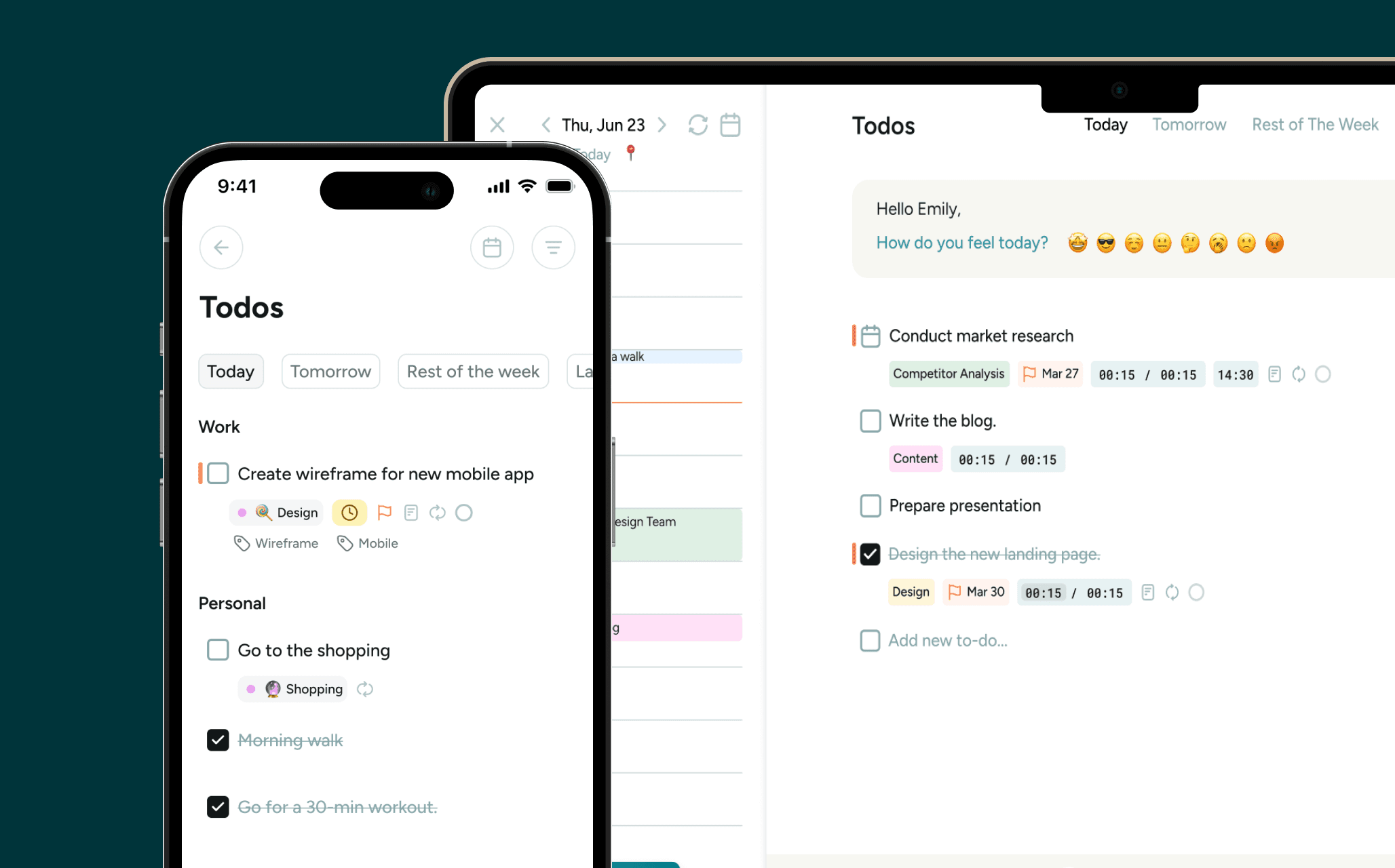
BeforeSunset AI was designed to deliver a seamless experience across both desktop and mobile. While the desktop interface focuses on comprehensive task and calendar management, the mobile version emphasizes quick access and on-the-go productivity. Together, they create a consistent and flexible workflow, ensuring users can plan, organize, and focus anytime, anywhere.